Overview
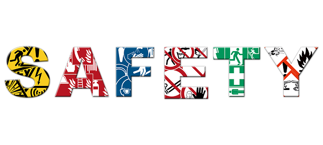 Safety signage is a simple, low-cost tool that helps prevent injuries and guide safe behavior in the workplace. Clear color coding and pictographs let employees recognize hazards at a glance, which is essential when someone has little time to read detailed text.
Proper signage reduces accidents, supports compliance with safety standards, and helps create a predictable work environment. Employers should evaluate signage placement, visibility, and employee understanding as part of routine safety reviews.
Key takeaways
- Color and pictographs communicate risk quickly: red for immediate danger, yellow for caution, green for safety or guidance.
- Signs must be visible, consistent, and reinforced through training so all workers recognize their meaning.
- Regular reviews and updates of signs reduce confusion as processes or layouts change.
- Specialized signage needs may require working with vendors or insurance professionals for compliance and risk management.
How it works
Most workplaces use a simple color system: red for immediate hazards that could cause serious injury or death, yellow to highlight potential hazards or unsafe practices that might cause minor injuries, and green for safety information, exits, and first-aid locations. Pictographs—simple images or icons—help communicate the message when text is unreadable or when workers speak different languages.
Signs should use high-contrast colors and plain wording; pictographs should be unambiguous and placed where they can be seen from the typical approach path. Lighting, obstructions, and sign height all affect visibility and effectiveness.
What it may cover (and what it may not)
Safety signage covers hazard identification (for example, flammable materials), required behaviors (such as PPE zones), emergency routes, and location of safety equipment. Good signage supports training programs and incident response plans.
Signage alone does not eliminate hazards. It complements engineering controls, safe work procedures, and training. Relying solely on signs without addressing underlying hazards or enforcing safe practices is insufficient.
Common mistakes to avoid
Placing too many signs or using inconsistent colors and symbols can dilute the message and confuse workers. Overly technical language or cluttered layouts reduce comprehension, especially in high-stress situations.
Failing to maintain signs—letting them fade, become obstructed, or fall out of date with current procedures—makes them ineffective. Also avoid using signs as a substitute for training or proper hazard controls.
Questions to ask an agent
When evaluating your workplace signage program, consider whether your current approach affects liability, operations, or insurance needs. If you need guidance on specific coverage or risk transfer options, resources such as Sign Lettering Insurance can help connect signage services and insurance considerations.
You may also want a professional review of your facility signage and compliance. For practical guidance on selecting and placing signs for different work areas, see Workplace Safety Signage and Compliance.
Next steps
Start with a short walk-through to inventory current signs and note any faded or obstructed postings. Update or replace signs that are unclear, and standardize colors and symbols across the site.
Train employees on what each color and pictograph means, then test understanding with short quizzes or toolbox talks. If you want a deeper review that includes insurance or vendor considerations, consult resources like Understanding Dementia and Workplace Safety for examples of adapting signage to specific workforce needs.
When you're ready to discuss coverage options or formalize a review, talk to an agent who can advise on risk management steps tied to signage and overall workplace safety.
Frequently Asked Questions
What do the colors on workplace signs mean?
Red indicates immediate danger, yellow warns of potential hazards, and green provides safety information or identifies exits and equipment.
Are pictographs necessary if text is clear?
Pictographs improve comprehension for non-native speakers and in emergencies when quick recognition matters, so they are recommended alongside text.
How often should signs be reviewed or replaced?
Review signs during routine safety inspections and replace them when they become faded, damaged, or when processes change.
Can signs reduce insurance costs?
Effective signage is one part of risk management and may support loss control efforts, but insurance impact depends on overall safety practices and claims history.